And we’re back.
Professionally and uniformly, it gets much more interesting. To a certain extent.
While you may say teams like the Yankees, Red Sox and Dodgers may have uniforms that seem bland, stop saying those things.
You’re wrong.
It’s not bland, its classic.
Some uniforms, on the other hand, need a major check up. I’ll take the Rays and Rockies as examples. And the thing is, they all have great material to work with.
Just look at the (Devil) Rays. Before they had Joe Madden, Evan Longoria, and a team that could actually play and even get to the playoffs, the Devil Rays were working with purple, green, and a picture of a manta ray. One would think, oh that could be lightweight swaggy. Well, again you’re wrong.
They ended up creating the most atrocious and awful uniforms in the history of mankind. I mean, really, who puts their entire logo on the front of their hat?
And furthermore, you have purple! One of the greatest sports colors. Look at the other teams that use purple and are able to pull it off: the Diamondbacks (for a while), the Kings (either the NHL or NBA version) and the Lakers, who have some of the greatest uniforms ever (they didn’t even need their white uniforms, Forum Yellow and Forum Blue would have been satisfactory, but oh no…here we go…they go ahead and do it. And it can only be summed up by one word: swag.)
So the Rays reorganized. They chopped off the Devil part of their name (who knows why they wouldn’t want to be associated with the cellar anymore) made their colors blue and a slightly darker blue, and BOOM! World Series appearance. Obviously it didn’t happen that quick, but you get my point. It obviously contributed to it all.
And then the Rockies. Again, what is it with bad teams and purple? Well, we don’t have as large a transformation as the Rays but here goes. The Rockies, obviously are the largest mountain range in North America. One would think that they could make a half-decent effort into making that into a sick uniform.
Well, they failed. First off, they wear only C R on their hats, which is a death sentence. Sorry Giants fans, but the only three teams that can really pull off the letters on the hat like that are the Dodgers, Cardinals and Yankees. And please…at least have letters that go together. C and R have no interlappage at all, at least L and A do, N Y again is just classic, and the StL just works.
And then, to top it all off, they wear pinstripes. How does that have anything to do with mountains, ranges, or any combination of those two words? None, that’s right.
And they aren’t even going to take the NL West’s playoff spot away from the Giants. Well, one can hope.
Enough of baseball you may say. Valid point. After all, this is the sport that takes 9 entire innings to play, doesn’t have a clock, and makes you wear pants. In summer. Good one.
So lets go to basketball. We already delved into my love of the Lakers, so I’ll take mercy on you readers (I’m just proud you got this far into my second column about the same exact subject as the first) and just go into other teams of the League.
Most teams have good uniforms. I guess.
(Can we just take a moment here and copy a part of Bill Simmon’s aptly named book The Book of Basketball? Please? Thank you. One thing that has irked him, and me too, is that the Jazz play in Utah. Come on America. Just move them back to New Orleans. Make the team the New Orleans Jazz. Please.)
Thanks. Now we’re back. The NBA has the most lopsided uniforms in any sports league that doesn’t have the initials of N, F, and L.
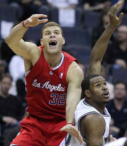
I mean, come on, look at the Clippers. Really? You call yourself a professional sports team? A basketball ‘flying’ through the air in thin lines with the words Los Angeles Clippers. You’re destroying the awesome-ness of LA. If I had a 4 year old little sibling, I’m sure him or her could create a vastly superior logo. And he/she would, again, be four (hypothetically). Four.

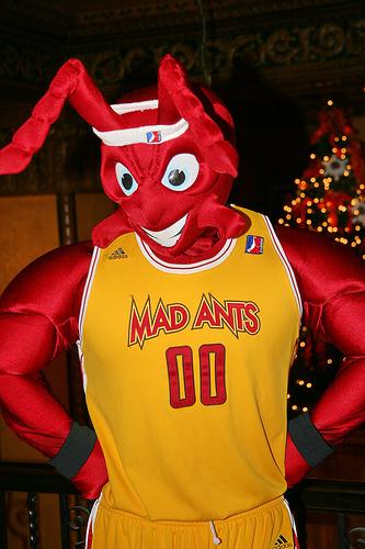
The Fort Wayne Mad Ants have a better logo that you and they’re from the D-League. Actually, for that matter, they all do. This is the D-League, Clippers. And they’re destroying you. So get going and start working on a new logo.
Plus, having a Clipper isn’t even that bad. Its a sick boat. Just like Diversity, the old, old wooden ship that was used in the Civil War era.
Otherwise, we have some pretty sick uniforms. One that I personally think deserves recognition is the Atlanta Hawks. Redoing their colors helped them immensely, changing from red and a truly hideous gold to red and a navy blue. The only person that could pull off their old uniforms was ‘Nique, and that’s a special case. They took out the stripe going across the chest for a more conservative “Atlanta” on their home whites, “Hawks” on their road blues, and pulling a leaf out of the Sun’s book (who were the first to use an abbreviation on their alternates, a “PHX” plastered on their unis), have “ATL” on their alternate reds. And all of them look pretty sick.
Another team that merits attention is the Providence Steamrollers.
Just kidding…they played in the 1940s. But still, that’s a pretty sick team name, you’ve gotta admit it.


